
Cramer
Impact driver
Next generation professional toolsBrief
To create a brand language for Cramer power tools

Project done in collaboration with Cramer, a German power tool brand owned by Globe Group. It focuses on gardening tools with battery technology. Key design elements
Speed linesProfessional FeelSimpleGood qualityErgonomic


-
Ergonomy
How to make the impact driver ergonomic for the target users?
-
Features
What features the impact driver should have so it is appealing to the customers?
-
Company identity
How does the impact driver should look like (shape, colour, texture, materials, patterns) so it matches Cramer’s design language?
-
Selling point
What kind of marketing strategy could be used to get more customers?
-
Trend analysis
What trends should be applied in the design process?
-
Presentation
How to showcase the product?

Mood board
Silver
Aesthetic
Topography
Rugged
Dynamic
Wave washed
Knurling
Ergonomic
Clean

Scenario sketching
The purpose of the scenario sketch is to visualize as much situations and interactions with the product as possible. The scenario sketch does not need to be highly detailed. The purpose is to understand the environment the tool is being used and the poses the user will use the tool.
Clay modelling
In the clay workshop four grips were made from hard clay. The clay models helped to create a shape that will be a suitable size for the final model

Ideation and concept generation
Ideating concepts based on the mood board. Semantic expressions considered are clean, compact, professional, ergonomic and rugged.
Digital sketching
I sketched my 3 favourite concepts in Photoshop. Cramer evaluated my designs and suggested to do some changes. After the feedback I did the last redesign and continued with surface modelling in Autodesk Alias.

Final concept
The final concept represent a professional and aesthetic looking impact driver designed to be compact.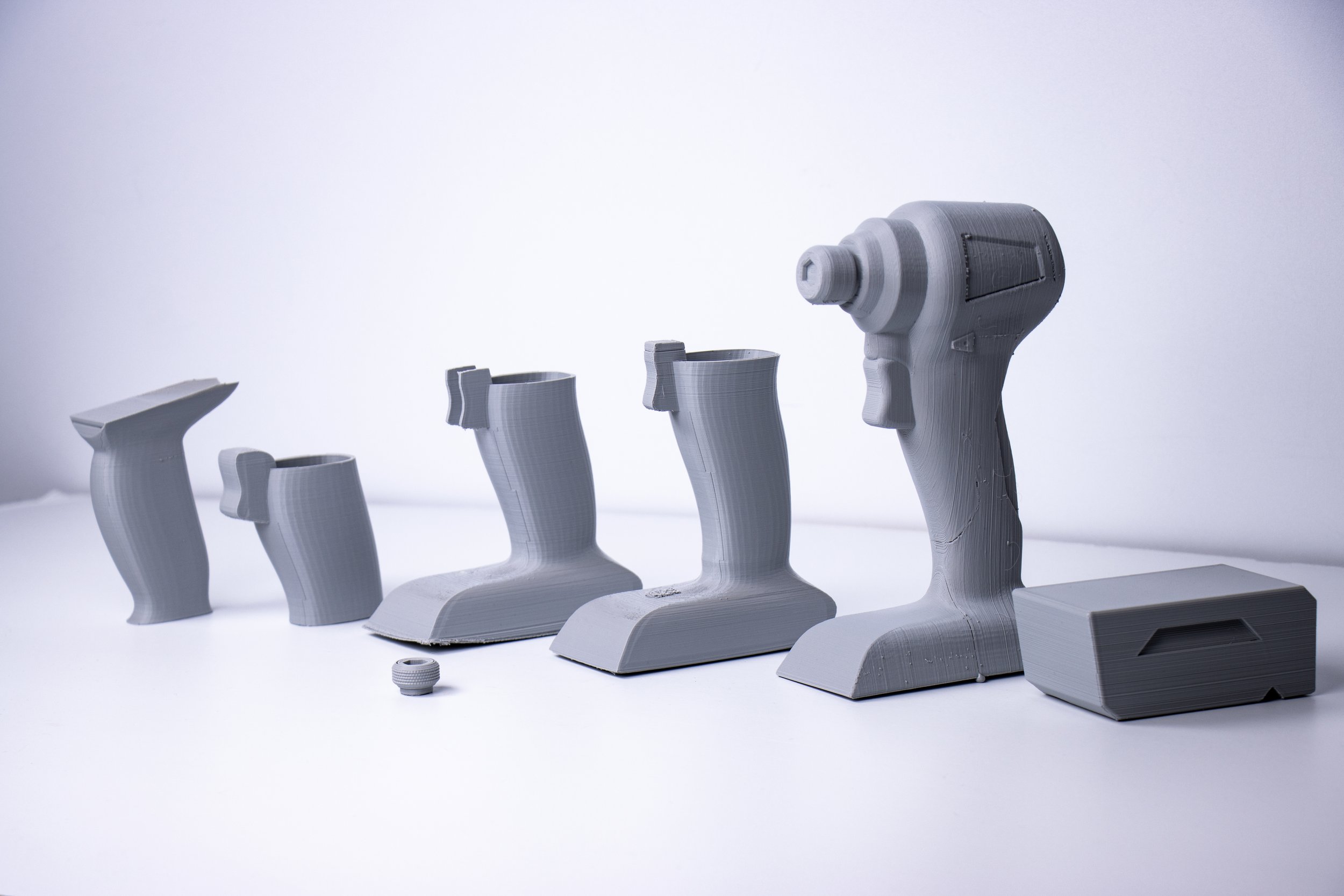
Prototyping
The evolution of the handle. The iterations grew in size as the model became more defined in dimensions. The push button also played an important role as it defines the whole feeling of holding the tool in the hand. The battery was also printed, because it affects the balance of holding the tool.
Final surface model renders
The final design of the impact driver has a clean appearance. The main focus was on the function and handling of the tool. The red colour brings the attention of the user to the parts where interaction happens. The black colour prevents the tool to appear dirty, as dirt blends easier with darker colours.
The Cramer logo appears twice on the left and right sides. On the head of the tool it is engraved/bossed into the metal sheet which serves as a heat radiator. The last rotating internal component on the back of the product is a fan which suck air onto the motor for cooling purposes.


Online store

Final prototype
